Designs
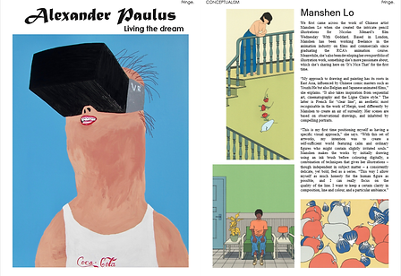
'Fringe' - Contemporary Art & Lifestyle Magazine


'Fringe' is a contemporary art and lifestyle magazine as it consists of different genres of arts, illustrations and drawings from different artists. This was designed for my Graphic Communication class. I learnt how to work with my friend as this was a pair work.
Through this project, I learnt basic technical skills and tools on how to design multiple pages in a magazine with different articles from Adobe InDesign. Also, I learnt how to play with the design layouts, where and when to place images and texts to make the overall magazine look suits the following theme.
'ZEST' - The Denim Issue Magazine


'ZEST' is a lifestyle magazine that features fashion and food. However, in this series, denim fashion and styles were featured. This was designed for my Magazine Design class. I learnt the to set the correct printing settings in Adobe InDesign as we had to print it out to an A4 sized magazine to make it realistic.
Through this project, I have learnt the importance of bleed in designing magazines as they played an important role. Arranging pictures accordingly to color themes are important for the aesthetics too.
'ZEST' - The Vegan Cookies Issue Online Magazine


'ZEST' is a lifestyle magazine that features fashion and food. In this series, 'ZEST' featured different varieties of vegan cookies' recipes, include Banana Chocolate Walnut Bars, Raspberry White Chocolate Cookies, Hazelnut Lemon Cookies etc. However, in this series, it is an online magazine where it gets interactive and readers who are into vegan cookies get to click 'previous', 'next', and get to choose which recipes they want to view.
Through this, I learnt to manage pages in Adobe InDesign. Also, I learnt to create buttons and and linked the buttons so that it can be reached to the pages respectively. As the targeted audience for this online magazine is for both adults and their children, I learnt to design in this way to ensure my design attracts both adults and children.
Beauty & Makeup Magazine Design


As part of my Magazine Design course, I have designed a 4-page magazine layout about beauty and makeup, focused on the brand Estee Lauder and TWICE, the South Korean girl group's collaboration of promoting the Double Wear Foundation in South Korea.
Through this, I've learnt the basic technical skills of Adobe InDesign and the use of key principles of design, such as proximity, balance and contrast to create a design layout that is appealing to my targeted readers.
CNY Social Media Post Design


International Women's Day Social Media Post Design
.jpg)
During my internship, I have designed some social media posts and these are some of the designs for the Chinese New Year celebration and International Women's Day, focused on Crew Lounge's very own designed Ang Pau as well as Crew Lounge's certified and experienced aviation trainers as a symbol of women empowerment.
Through this, I've learnt the technical skills of Adobe Photoshop and the use of key principles of design, such as proximity, balance and contrast to create a design layout that is appealing to the designated target audience.